
- Paintball Apparel
- Accessories
- Arm Bands
- Arm Warmers
- Back Packs
- Bandana & Head Bands
- Denim Headbands
- Banners
- Barrel Covers
- Paintball Barrel Swabs
- Barrel Sleeves/Bands
- Beanies
- Embroidered Badges
- Chenille Patches
- Blank Patches
- PVC Patches
- Night Glow Patches
- Sublimated Patches
- Sublimated Key Chains
- PVC Key Chains
- Goggle Bags
- Headwraps
- Shemagh
- Pods
- Pod Bags
- Duffle Bags
- Tactical Vests
- Wallets
- Paintball Gloves
- Tactical Gear
- Tactical Backpacks
- Tactical Beanies
- Tactical Belts
- Tactical Caps
- Tactical Face Covers
- Tactical Gloves
- Tactical Gun Bags
- Tactical Gun Holsters
- Tactical Harness
- Tactical Jackets
- Tactical Jerseys
- Tactical Pants
- Tactical Pouches
- Tactical Protective Pads
- Tactical Radio Pouches
- Tactical Shemaghs
- Tactical Shirts
- Tactical Vests
- Airsoft Gear
- Casual Wears


Bold Fonts, Bigger Numbers: A Design Guide to Typographic Paintball Jerseys

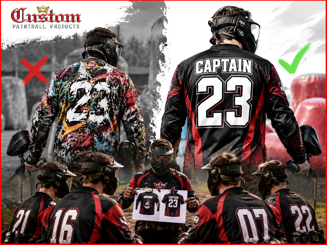
Typographic Dominance: Using Large-Scale Fonts for Custom Team Jerseys
Big letters beat busy graphics. That’s the short version. Typographic paintball jerseys use oversized numbers, bold words, and wrap-around text instead of loud vector art. They read fast on a crowded field and photograph well. They look modern, not messy.
If you’re a team captain picking a design style for your next order, go typographic when you want a clean, tough look that’s easy to spot from far away. Skip it only if your team logo or mascot art is the main thing you want people to remember.
Below, we break down how typography-first jerseys compare to graphic-heavy designs, when each style works best, and how to plan your own layout. Near the end, you’ll find a comparison table and answers to common questions. When you’re ready to build your own design, custompaintball.co can help you turn these ideas into a real jersey.
What Is a Typographic Paintball Jersey?
A typographic jersey uses text as the main design element. The team name, player number, or a short phrase becomes the artwork itself.
Instead of a detailed skull, flame, or animal graphic covering the shirt, you get:
- A giant number running from the shoulder to the waist
- A team name stretched across the chest in bold block letters
- A repeating word pattern wrapped around the sleeve or side panel
- A single strong phrase used as the whole back design
Think of how running brands and esports teams use big, blocky text on their gear. Paintball is borrowing that same idea. It’s less about drawing a picture. It’s more about making words impossible to miss.
Why This Style Is Growing
Three things are driving the shift toward custom jersey text patterns.
First, sublimation printing has gotten sharper. Teams can now print crisp, large letters without the fuzzy edges older printing methods left behind.
Second, tournament fields are loud and visual. Referees, teammates, and spotters need to identify players fast. A number that’s ten inches tall is easier to call out than a small logo tucked in a corner.
Third, minimal design is trending across sports gear in general. Teams want a look that feels current, not like it was copied from a 2012 catalog.
Typographic vs. Graphic-Heavy Design: The Core Comparison
Let’s compare the two main design paths that captains choose between.
Graphic-Heavy Jerseys
These jerseys lean on illustrations. Think flames, skulls, camo patterns, mascots, or detailed scenes covering most of the fabric.
Strengths:
- Great for storytelling and team identity (a wolf mascot, a skull-and-crossbones theme, etc.)
- Can feel more aggressive or intimidating
- Works well if your team already has a strong logo
Weaknesses:
- Small details get lost at a distance or in photos
- Busy backgrounds make player numbers harder to read fast
- Can look dated faster as trends shift
- Harder to keep clean and non-cluttered
Typographic Jerseys
These jerseys lean on bold font paintball gear design — big words, big numbers, strong contrast.
Strengths:
- Numbers and names are readable from far away
- Clean look that photographs and films well
- Feels modern and matches current sportswear trends
- Easier to keep the design from looking cluttered
- Works at any team size, from weekend squads to sponsored teams
Weaknesses:
- Less room for detailed team mascots or story-driven art
- Needs a strong font choice — a weak font choice can look plain
- Relies more on layout skill than illustration skill
Where Typography Wins: Oversized Team Numbers
Let’s talk about the piece most captains care about most: the number.
Oversized team numbers are the heart of this style. Instead of a standard 4-inch number on the back, teams are going with numbers that stretch across the whole back panel, sometimes bleeding into the side seams.
Why Bigger Numbers Actually Matter in Paintball
Paintball is fast. Players are moving, crouching, sliding behind bunkers. A small number is hard to read even at rest — it’s nearly impossible mid-game.
Bigger numbers help with:
- Team communication. Callouts happen faster when a number is easy to spot.
- Referee tracking. Refs calling penalties or eliminations need a fast, clear ID.
- Spectator and stream clarity. For teams that stream or get filmed, big numbers read clearly even on a small phone screen.
- Sponsor visibility. A number placed well doesn’t compete with sponsor logos — it works with them.
Common Number Placement Styles
| Placement Style | Description | Best For |
|---|---|---|
| Full-back giant number | Number fills almost the entire back panel | Teams that want max visibility |
| Side-wrap number | Number wraps from back to side panel | Teams wanting a 3D, dynamic look |
| Shoulder-to-hem number | Number runs vertically top to bottom | Teams wanting a tall, sharp silhouette |
| Dual-tone number | Number split into two colors down the middle | Teams with two main brand colors |
Custom Jersey Text Patterns: Beyond the Number
Numbers aren’t the only place text can shine. Captains are also using repeating text patterns as background texture — a technique borrowed from streetwear.
How Text Patterns Work
Instead of a busy graphic background, designers repeat a short word or phrase in a grid or diagonal pattern across part of the jersey. Common choices:
- The team name, repeated small and tiled
- A motto or slogan, repeated diagonally
- The team’s city or region name, repeated in a subtle tone-on-tone print
This creates texture without noise. From far away, it can look like a solid color or subtle pattern. Up close, it reveals the words. That’s a detail players and fans notice and appreciate.
Example Layout Ideas
Example 1: Tone-on-Tone Slogan Wrap A black jersey with the phrase “NO FEAR NO MERCY” repeated in a slightly darker black print across the side panels. It’s nearly invisible from a distance but adds depth up close.
Example 2: Sleeve Cuff Text Band A bold, single-color word like “STORM” printed in a repeating band around each sleeve cuff. Simple, clean, and adds a finished look without extra clutter.
Example 3: Diagonal City Name Pattern The team’s home city name repeated at a 45-degree angle across the lower back, sitting behind the main number so it reads as texture, not a second focal point.
Modern Player Numbering: What’s Changing
Modern player numbering isn’t just about size. It’s also about style, spacing, and how the number interacts with the rest of the jersey.
Trend 1: Numbers That Interact With Seams
Instead of sitting inside a boxed panel, numbers now often stretch across seams and panel lines, making the whole jersey feel like one connected design instead of separate pieces stitched together.
Trend 2: Outline-Only Numbers
Some teams are going with outline-style numbers — just the number’s edge is printed, with the jersey’s base color showing through the middle. It’s a subtle, modern look that still reads clearly at distance.
Trend 3: Mixed Weight Fonts
Pairing a heavy, bold number with a thinner, lighter team name creates contrast. It keeps the design from feeling flat or one-note.
Trend 4: Negative Space Numbers
Advanced designs use negative space — meaning the number is “cut out” of a solid color block rather than printed on top of it. This adds a graphic, high-end feel while staying purely typographic.
How to Choose the Right Font for Bold Font Paintball Gear
Font choice makes or breaks a typographic jersey. Here’s what to think about.
1. Readability at Distance
Test any font by shrinking it on your screen until it’s small. If you can still read it clearly, it’ll likely hold up on the field too. Thin, decorative fonts usually fail this test.
2. Weight and Boldness
Go heavy. Bold, thick-stroke fonts hold their shape when printed large and stay readable in motion. Thin fonts can look weak or disappear against busy backgrounds.
3. Character Spacing
Tight spacing can look modern but risks letters blending together. Loose spacing helps readability but can look stretched if overdone. A balanced middle ground usually works best.
4. Team Personality
A rounded, friendly font sends a different message than a sharp, angular one. Match the font’s personality to your team’s identity — aggressive, disciplined, playful, or classic.
Quick Font Style Guide
| Font Style | Feel | Good For |
|---|---|---|
| Bold block/sans-serif | Strong, clean, modern | Most competitive teams |
| Condensed bold | Tall, sharp, aggressive | Teams wanting an intimidating look |
| Slab serif | Rugged, tough | Teams with an old-school or military theme |
| Athletic script | Fast, dynamic | Teams wanting movement and energy |
Step-by-Step: Planning a Typographic Jersey Layout
Here’s a simple process captains can follow before placing an order.
Step 1: Pick Your Anchor Element Decide if the number, team name, or a slogan will be the main focal point. Only pick one. Trying to make everything equally big creates clutter.
Step 2: Choose Two Fonts Max One bold font for the anchor element. One lighter font for secondary text like sponsor names or player last names. More than two fonts starts to look messy.
Step 3: Set Your Color Contrast Text needs strong contrast against the base jersey color. Dark text on light fabric or light text on dark fabric reads best. Avoid similar-toned combinations.
Step 4: Decide on Texture Choose whether you want a repeating text pattern in the background or a clean solid base. Both work — just don’t combine too many textured elements at once.
Step 5: Test at Multiple Sizes Before finalizing, look at a mockup from “close up” and “far away” zoom levels. What looks good in a design file doesn’t always look good from 40 feet away on a field.
Step 6: Get a Second Opinion. A design team that works with sports gear daily will catch spacing or contrast issues you might miss. This is where working with custompaintball.co can save you a redo down the line.
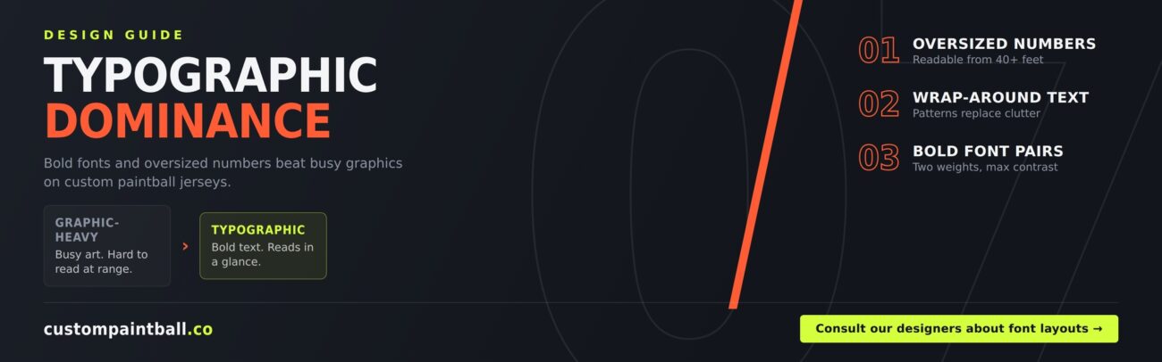
Typographic vs. Graphic: Quick Decision Table
| Question | Choose Typographic | Choose Graphic-Heavy |
|---|---|---|
| Do you want max readability at distance? | Yes | No |
| Does your team have a strong mascot or logo already? | Maybe not needed | Yes, lean into it |
| Do you want a modern, current look? | Yes | Depends on style |
| Do you stream or get filmed often? | Yes | Less ideal |
| Do you want a simpler design process? | Yes | No, more complex |
| Do you want a story-driven design? | Less so | Yes |
Common Mistakes to Avoid
Even a great idea can go wrong in execution. Watch out for these:
- Too many fonts. Stick to two, max three, font styles per jersey.
- Low contrast. Gray text on a slightly different gray background won’t read well from any distance.
- Overcrowding. If the number, name, sponsors, and pattern are all fighting for space, nothing stands out.
- Ignoring seams. Text that gets cut off oddly at a seam looks like a printing error, even when it isn’t.
- Skipping the mockup review. Always check a full mockup, front and back, before approving final printing.
Why Teams Are Making the Switch
A lot of captains switch to typographic paintball jerseys after one season of struggling with hard-to-read graphic designs. Here’s what they usually notice:
- Faster team communication during matches
- More consistent, professional look across a full roster
- Easier reordering — text-based designs are simpler to adjust for new players or sponsors
- Stronger presence in photos and video, which matters more every year as more matches get streamed
None of this means graphic designs are bad. It just means typography solves specific, practical problems that busy artwork can’t always solve.
Frequently Asked Questions
Q: Are typographic jerseys more expensive than graphic-heavy ones?
A: Not usually. Cost depends more on the number of colors and print method than on whether the design uses text or graphics. A clean typographic design can actually be more budget-friendly since it often uses fewer colors.
Q: Can I still include a small team logo on a typographic jersey?
A: Yes. Most typographic designs still include a small logo on the chest or sleeve. The key is keeping it small and letting the big text stay the main focus.
Q: What font size works best for oversized team numbers?
A: There’s no single fixed size, since it depends on jersey size and layout. As a general rule, the number should be the largest single element on the jersey and should be readable from at least 30 to 40 feet away.
Q: Will a repeating text pattern be too busy for a fast-paced sport like paintball?
A: Not if it’s done right. Tone-on-tone or subtle-contrast patterns add texture without pulling focus away from the main number or name.
Q: How many fonts should one jersey use?
A: Two is the sweet spot. One bold font for the main element, one lighter font for secondary details. Three can work if done carefully, but four or more usually looks cluttered.
Q: Can typographic design work with camo or patterned base fabric?
A: Yes, but it takes extra care. High contrast is even more important on a patterned base, since text needs to stand out clearly against a busier background.
Ready to Build Your Team’s Jersey?
Big, bold text isn’t just a trend — it’s a practical upgrade for teams that want to be seen, read, and remembered on the field. Whether you’re after oversized numbers, a repeating slogan pattern, or a clean modern name treatment, the right font layout can carry your whole design.
Consult our designers about font layout options for your next wow paintball jersey. The team at custompaintball.co works with captains every day to turn simple text ideas into jerseys that actually perform under field conditions — not just look good in a mockup.
👉 For more information before purchasing your desired custom paintball jersey, feel free to contact our designer team for guidance!
